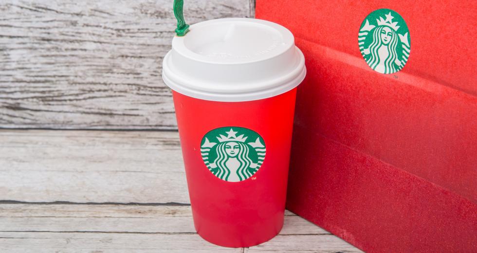
It’s no secret Starbucks’ holiday cuptroversy has created a lot of extra buzz for them this season. By removing the ‘“symbols of the season,” the coffee giant is being accused of going overboard to be politically correct. This new, bold design ignited an overblown conspiracy theory that got the internet chattering. But instead of mourning the loss of kitschy graphics, we are applauding Starbucks on their brand’s success.
As marketers, designers and coffee addicts, we casually look forward to the unveiling of their annual holiday cup design. Like it or not, the red cup has become a national holiday beacon of festivity. This year, instead of the typical illustrated holiday cup, Starbucks gave us the mermaid, a solid red gradient — and that’s it.
Like Pavlov’s dog, Starbucks has been conditioning us for years. Once Thanksgiving ends, it’s time to start decorating and shopping, fueled by the red cup warming our hands. Starbucks wants us to make their brand part of our seasonal traditions and, although we won’t remember what graphics are on the cup, we know it’s red.
In the early days, the cup was festooned with illustrated characters and festive quotations on that scarlet background. Over the last five years, the red stayed constant, but the illustrations went from festive characters to more refined and stylistically modern ornaments. The past designs have been warm, friendly and hand-drawn. Last year, the markings were sweeping brushstrokes of pine trees and snowflakes, almost watermarked, red on red—a perfect lead into 2015’s design. Modern and sleek, this year’s cup follows the flat design trend but adds a subtle ombre to give it a little depth and anchor the logo. The vermilion ink is so saturated and crisp against the white interior (someone needs to give the printer props on holding that color consistency!) that it looks like velvet.
From a marketing standpoint, by simply printing a red background, Starbucks has created a clear call-to-action each year: Get festive, drink our coffee and be an ambassador. The red cup is so recognizable that when you see someone walk by with one, you probably wonder where you can get your own caffeine fix nearby.
In years past they’ve also had to give us clear, if not complicated, instructions on what they wanted us to do: In 2006, they used launched a campaign that was the start of an actual social movement. The Cheer Pass campaign distributed numbered tickets that customers were encouraged to share alongside small gestures of kindness (hold open a door, offer your seat or gift a latte). One would receive (or download) a Cheer Pass, pay it forward with a good deed, then log onto itsredagain.com (now defunct) to follow one act of cheer as it moved around the world. This fairly cumbersome viral campaign has now evolved into a sweet (or high-pressure) tradition at their drive-thru locations of customers buying a drink for the next person in line. In some stores, these random acts of kindness went on for days without breaking the streak. This, of course, is beautiful free publicity of the best kind — surrounding your brand in random acts of altruism that smack of a feel-good holiday movie.
Those who think Starbucks suddenly decided to remove all symbolism from their cups aren’t looking at the long-game strategy the company has been playing. Starbucks has a goal — they want us to be cheerful to others while sipping our peppermint lattes. And repeat. They’ve accomplished this by telling us exactly what to do through a decade of major investments in advertising, digital development, environmental displays and of course, the millions of traveling billboards we clutch.
Now, in 2015 they can drop all the clutter and the denuded red cup is Starbucks’ call-to-action. Congratulations, Starbucks — you’ve hit brand transcendence and reached an enviable goal: You can engage the masses without saying a word.


