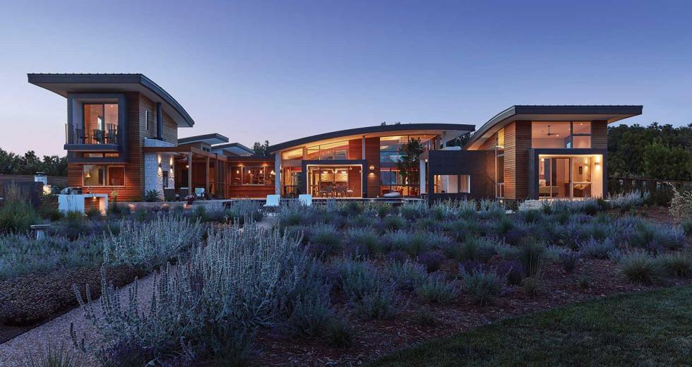
Modern architecture has evolved. So have its admirers. Once considered a stark and cold aesthetic, today’s residential modern design employs variety and warmth, embracing the clean and simple as well as the soaring and sweeping. No one idea or style dominates. Here we showcase some of the Capital Region’s modern homes and the architects who designed them.
Architects and owners:
Melissa Szpik Serrao and Jay Serrao, Serrao Architecture + Construction
(Photo by Kat Alves, courtesy of Serrao Design | Architecture)
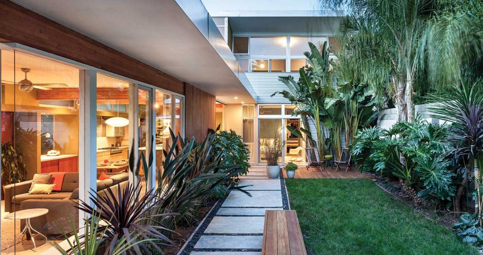
Husband-and-wife architects Melissa Szpik Serrao and Jay Serrao have been practicing together for more than a quarter century. They met in the mid-1990s as architecture students at California College of the Arts and worked for the same downtown San Francisco firm before founding their own design and architectural firm in 1998.
In 2007, the couple bought an urban infill lot in Sacramento’s Land Park neighborhood, walkable to a number of nearby amenities. A move of their practice and family followed (Serrao is a Sacramento native). With an urban site, they felt it was important to address the street, but also focus inward to create privacy. The office, which is a more public space, is oriented toward the north and faces the street. The bedrooms and living areas, which are more private, open to the rear and the south where the natural Delta breeze cools the rooms. The home’s signature element, a decidedly modern butterfly roofline, is visually stunning but also creates a practical solution for filling the spaces with more natural light. “It’s really a functional form, but an aesthetic nod to modernism and midcentury and other things we find joyful,” says Szpik Serrao.
The material palette consists of durable, natural elements that are exposed and resilient. “What we strive for is an honesty about our construction,” says Serrao. “When we create structure, we try to reveal that if we can.” Examples include exposed beams that support roof and floor loads, raw concrete block and natural woods. The floors are polished concrete. Outside, corrugated metal and oiled clear cedar have been designed to naturally patina.
(Photo by Kat Alves, courtesy of Serrao Design | Architecture)
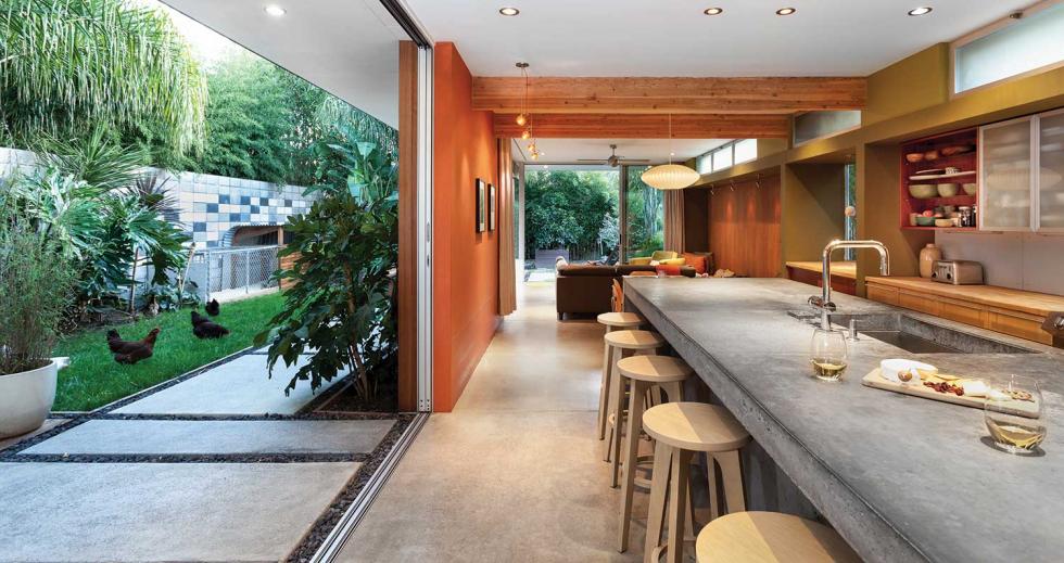
Plantings, including mature palm trees and tropical vegetation, soften the exterior expression and provide a parklike environment in the urban setting. Oversized sliding glass doors tuck behind the interior wall to create seamless indoor-outdoor access to the comfortable backyard.
The 2,600-square-foot home was designed and built over four years during three-day weekends. The architects did most of the work themselves with the help of family. Serrao fabricated the open steel staircase, which was configured on-site, with his brother-in-law. He also built most of the interior cabinetry.
The couple maintains a 600-square-foot home studio where they do the bulk of their research and development for work. An extensive design library with detailed architectural models provides easy access to inspiration.
“Design is one of those things for us that is an ongoing effort,” says Serrao. “Having a home studio has been a wonderful thing, because you never know when inspiration hits. I can pop up to the studio for an hour and work on an idea and come back down for dinner. I think that’s probably been the most consistent thing in our lives — we’ve always managed work and our family life together.”
Architects: Pam Whitehead and Paul Almond, Sage Architecture
Clients: Michael and Evelyn Heller
(Photo by Vance Fox, courtesy of Sage Architecture)
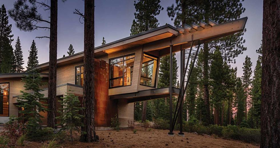
Aptly named the Flight House for its oversized, sweeping rooflines, the modern Truckee residence is hard to ignore. Tucked in the expansive Martis Valley, the distinctive home has been compared to art in motion. Designed by Sacramento-based Sage Architecture as a second home, the clients — Michael and Evelyn Heller, who are well-versed in art and architecture (Michael owns Heller Pacific, a real estate development company) — granted the architects free rein in the way the program elements would combine with the site. “That gave us the ability to look at architecture as art and sculpture,” says Sage cofounder Pam Whitehead. “It was very much about shapes and their engagement with the land.”
A heavily forested and sloping lot dictated the parameters of the usable space. A sheltered patio space was placed at the front of the house to capitalize on the views and solar orientation. A front courtyard area and grassy expanse wraps around the elongated entry and provided a safe and protected place for the couple’s twin daughters to play (the home has since been sold). Natural materials that stand up to the extreme winter weather include stained cedar, Corten steel, a standing seam roof, glulam beams and steel columns. The soaring, engineered wood beams are expressive and exposed and give the home its unique shape and character. Designing for the extreme climate was a challenging undertaking for the architects and the clients. The structural design and snow-load requirements had to be carefully balanced with the modern aesthetic.
(Photo by Vance Fox, courtesy of Sage Architecture)
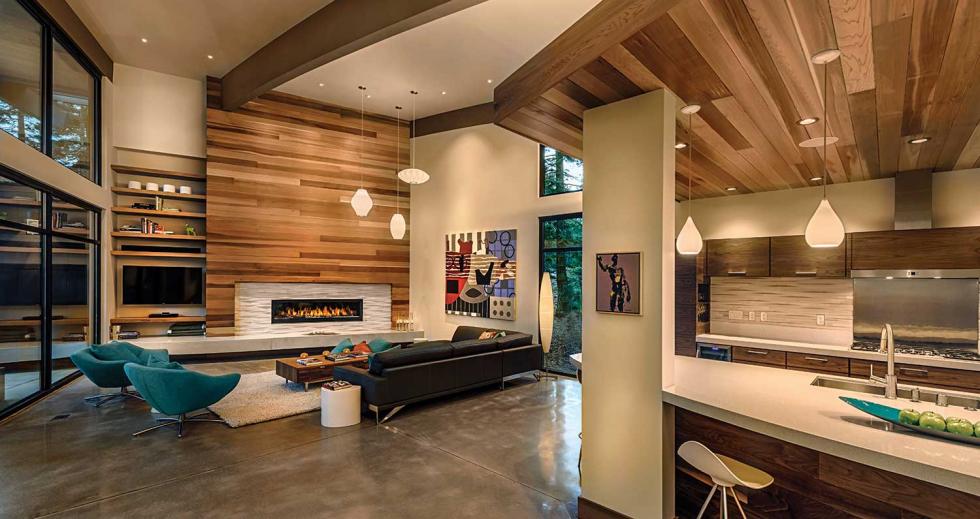
Adding a significant amount of glass also meant complying with the California Energy Code. Deep overhangs were used in strategic places to provide shelter from the summer sun and allow for sun penetration in the winter. The natural, muted tones were duplicated on the interior with horizontal cedar slats covering walls and ceilings. Grays and whites were selected for the paint colors and the finishes to accentuate the modern spaces. The floors are reclaimed teak and polished concrete, with radiant heat throughout. The architects designed the custom walnut cabinetry, and quartz composite countertops were added for their beauty and durability.
In the open great room, an oversized fireplace features a lengthy, floating hearth fabricated from poured concrete. A front office space is encased in glass and elevated, giving the room a private wraparound view. The elongated overhead beams jut out to a terminus beyond the home’s footprint. Michael Heller says the office prow is “one of my favorite elements on the home. That and the roof lines. Both features are so unique.”
Architect: Gennifer Muñoz, Studio Oxeye
Clients: Eric Flanquart and Sumi Mishra
(Photo courtesy of Studio Oxeye)
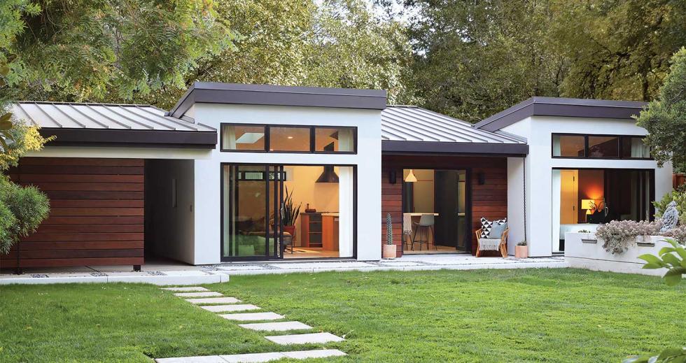
Eric Flanquart and Sumi Mishra’s large double-infill lot is a bit of a rarity in Midtown Sacramento. The front parcel, on G Street, is used for the couple’s main residence, but they struggled with how to utilize the rear portion along Government Alley.
They contacted architect Gennifer Muñoz, principal at Studio Oxeye, to ask about solutions for parking. The couple had a young son and a baby on the way, and the conversation with Muñoz evolved into the need for a guest house for the couple’s extended families. Mishra’s family is from India and Nashville, and Flanquart’s reside in France, so when visiting, they often stay for extended periods. The goal was to create a modern secondary dwelling unit that could house family and guests but also connect to the main home. The couple showed Muñoz some images of modern designs but were open to her creative ideas. “We have always liked the modern aesthetic, and we wanted to create something of architectural and historical value for future generations of building lovers,” says Flanquart.
The architect called for a clean aesthetic inspired by midcentury details: black, white, wood and concrete, integrated with natural elements like Mexican pebbles. White stucco was used as the primary exterior material to tie into the main house. Horizontal siding made of ipe, a South American hardwood, and Corten steel panels that naturally patina add warmth to the modern palette. A black standing seam metal roof and black trim provide a contrast to the white siding.
The primary design concept was based on breaking down the interior spatial requirements by function; the roof planes switch with each room and also down the length of the building, earning the project the nickname Switch House. “I’m a believer in a building expressing its function,” says Muñoz. “Instead of having one giant echoing room, the building form creates these really beautiful articulations of the vault based on the shape of the roof.” The design helps to break down the space and creates interesting opportunities for interior painted accent walls with angular shapes. Contemporary kitchen cabinets feature Douglas fir and complementary tones of green. The countertops and floors are both finished concrete.
(Photo courtesy of Studio Oxeye)
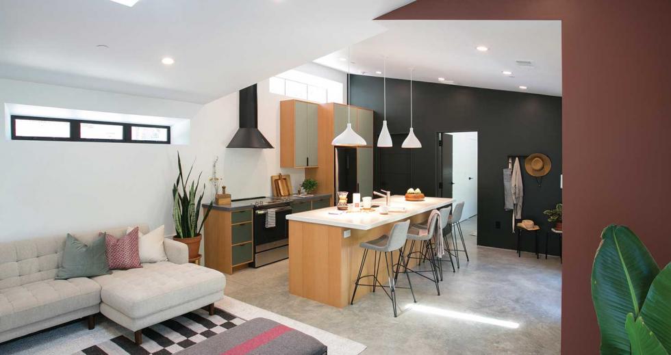
Custom steel light fixtures were designed by the architect and welded by her husband, who is a general contractor she collaborates with often. Large glass doors and windows flood the space with natural light and extend the living space to the outdoors. Discreetly placed windows on the rear of the home bring in much needed daylight and ventilation, and also for privacy from the alley.
“The city actually loved the design for this home and encouraged the alley development,” Muñoz says. “They have a new initiative where they are really trying to improve the alleys to inspire a more pedestrian-friendly city.”
Architect: Pam Whitehead and Paul Almond, Sage Architecture
Clients: Harold and Liz Schmitz
(Photo by Abraham & Paulin Photography, courtesy of Sage
Architecture)
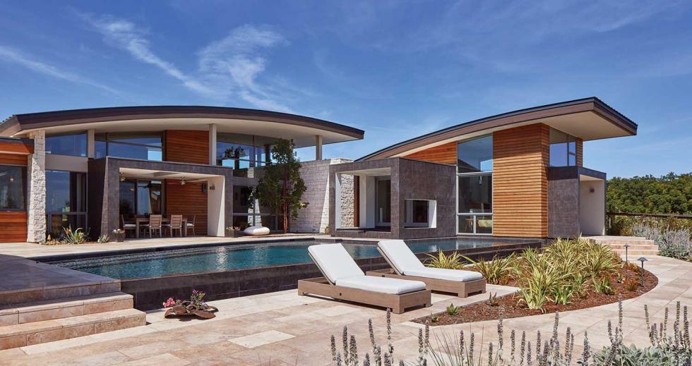
East Coast transplants Harold and Liz Schmitz were looking for a change after living in a traditional Maryland colonial. They liked the idea of a quintessential modern California home with year-round outdoor living but didn’t want to go too far. “The most challenging part of the building process was grappling with the feelings of fear that the design might perhaps be too modern for our taste,” Liz says. “But during the design process, Sage (Architecture) made us comfortable that we could enjoy all the benefits of modern, including clean lines and energy sustainability, while maintaining the feeling of warmth that we were looking for.”
The design incorporates undulating, curving roof lines that open to the sky and mimic the nearby rolling hills. The expressive nature of the roof created opportunities for the architects to bring in lots of natural light in the winter months, while designing natural overhangs that protect during the summer months. Much of the home is clad in horizontal tongue-and-groove cedar siding. Box elements used to frame portal views and entry elements feature large gray tiles that resemble metal panels, while the interior face is a contrasting smooth white plaster. A standing seam metal roof and metal clad exterior complement the modern design. Textural elements like limestone that are introduced on the exterior slice through the building to present in the interior spaces. “That’s one of the things we like to do,” says Whitehead. “If we use a material on the outside and we have a big opening, we’ll always pull that material inside, because we love to blur the line between the interior and exterior spaces.”
(Photo by Abraham & Paulin Photography, courtesy of Sage
Architecture)
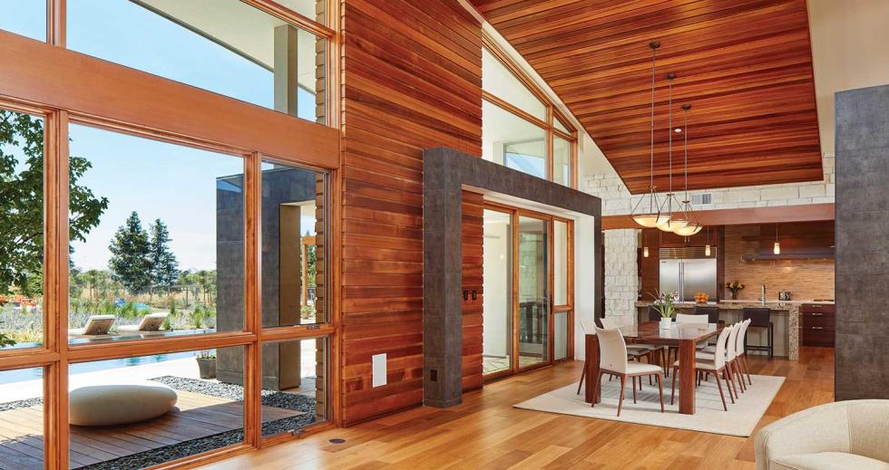
The custom-designed wood-and-steel front door opens to an intimate foyer with see-through fireplace, creating a soft barrier between the entry and living spaces. The dining room, on the opposite side of the entry fireplace, has sweeping ceilings and a massive live-edge table designed by the architects. The floors are a smooth-grain natural European oak, and the cabinetry is natural walnut. Accordion doors in the master suite give way to a tranquil yoga deck that connects to the outdoor spa, and a wall of windows frames a view of the swimming pool that abuts the edge of the glass. An outdoor dining space completes the oasis. Separate guest quarters comfortably house visitors, and a solo office space offers coastal range views from its second-story perch.
“The complexity of the overall design and getting the materials to all marry together with one another was a challenge, but the repeated design elements throughout the house make your eye understand how everything ties together,” says Whitehead.
Designer: Curtis Popp, CPopp Workshop (designed under Popp Littrell Architecture + Interiors)
Architect: Dustin Littrell, Littrell Architecture + Design
Clients: Anil Kawediya and Hema Oswal
(Photo by Kat Alves, courtesy of CPopp Workshop)
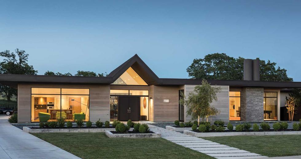
Sacramento designer Curtis Popp is interested in all kinds of design disciplines: furniture, architecture, interiors, automotive design. “I’ve never had any boundaries,” he says. “I like to do all aspects of it.” The creative practitioner feels residential architecture and interiors are small enough that he can touch every aspect of his projects. After working for others, the California College of the Arts graduate launched his own design practice in 2001.
In 2014, Anil Kawediya and Hema Oswal approached Popp about designing a home on a parcel they purchased in the Broadstone community of Folsom. “They really weren’t sure what they wanted,” says Popp, “but after a few exercises, their contemporary ideas morphed into something more modern and evolved over time.”
Popp originally designed the modern residence with a membrane thermoplastic polyolefin flat roof, but the builder’s design review committee had some objections. Eventually, a gable was added that gives the home its Eichler-esque, midcentury look. The roofline also has deep overhangs to protect the homeowners from the harsh sun. To complement the site, Popp leaned toward a more organic and natural design, installing western red cedar on the exterior. The planks came presealed and pre-aged to cut down on maintenance. Straight grain, white oak was used for all the interior millwork, and polished and sealed concrete floors were used throughout the house. The sunken living room hearkens back to an earlier era with a nod to the midcentury aesthetic.
(Photo by Kat Alves, courtesy of CPopp Workshop)
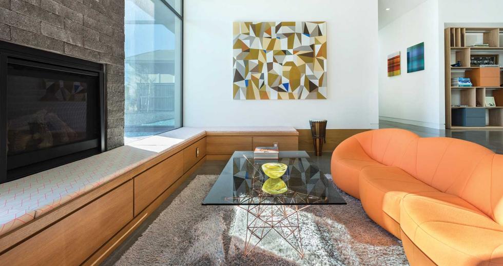
The palette of the house is very simple, so Popp opted to bring in splashes of vibrant color through the furniture and the artwork. Bold chartreuse seating and a Persian rug make a statement in the kitchen conversation space, while an orange sofa and geometric artwork brighten the recessed living room. A unique subterranean bonus room, which serves as the family’s audiovisual space, was added and tucked underneath the master suite. Large expanses of floor-to-ceiling glass are abundant and bring in plenty of daylight. “Looking at the house when it’s dark outside and the house is lit up from inside will never get old,” says Kawediya. “It’s breathtaking.”
Architects: John Klopf and Geoff Campen, Klopf Architecture
Clients: Declined to be disclosed
(Photo by Mariko Reed, courtesy of Klopf Architecture)
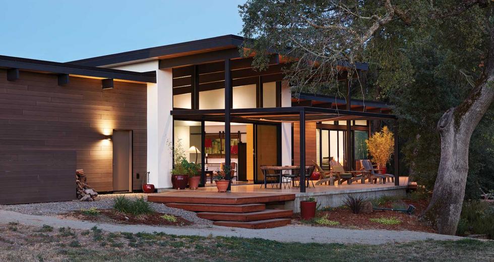
When clients reached out to John Klopf and Geoff Campen of Klopf Architecture for help designing a home, they had been living on their semirural property in Orangevale for many years. They had recently become empty nesters and were ready for a change. The original plan was to remodel the existing bedroom wing and living areas of their traditional home, but the concrete slab was deemed too thin. To get the modern home they wanted, the project required a complete teardown.
The lot is dotted with centuries-old oak trees and a seasonal creek; connecting to that was paramount. The architects’ goal was to design multiple seating options that would smartly blur the lines between indoor and outdoor living, while also preserving privacy. “There was a balance that had to be struck between privacy and connecting to the outdoors,” says Klopf. “We used large glass expanses but also added a solid wall across the front that blocks a lot of the direct view into the house and still allows for an open plan with a continuous wall of glass.” A metal-framed trellis topped with a canvas cloth was artfully designed to help diffuse the direct sun and create a comfortable outdoor space in front. Deep, modern overhangs add protection in the rear.
“From a pure lifestyle element, modern homes, by nature, are fairly exposed. It’s very much about living simultaneously inside and outside with nature. Just because our front door is closed doesn’t mean we are not still living with nature on all sides,” the homeowner says. “It’s beautifully transparent.”
(Photo by Mariko Reed, courtesy of Klopf Architecture)
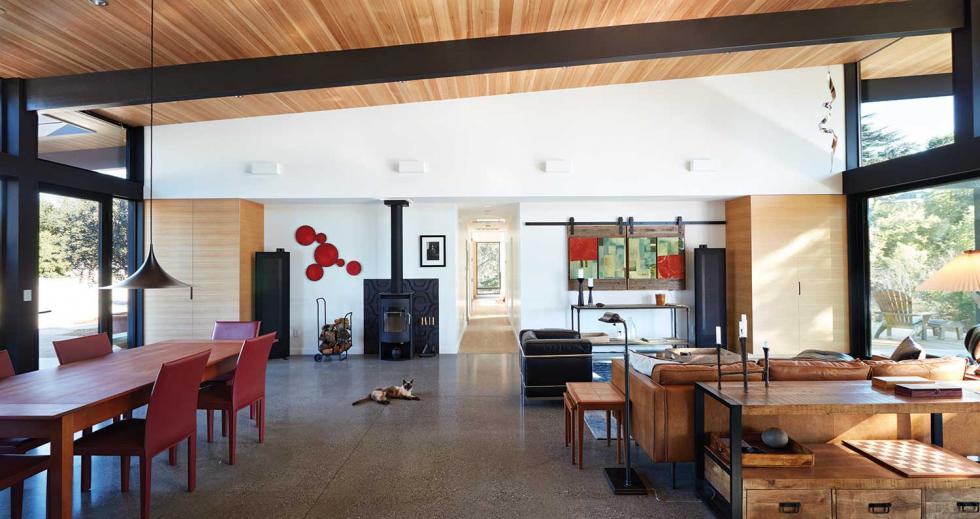
The homeowners — a professional baker and a television producer — also really liked wood and desired a lighter species to express a warm and casual modern. In keeping with that mandate, the architects selected hemlock — a locally sourced and available wood — for the interior ceiling, which also extends to the exterior overhangs, creating a seamless modern look. The floors are a durable white oak, and salvaged reclaimed wood was added to the face of the island.
A large great room with sealed concrete floors and soaring hemlock and engineered wood-beamed ceilings preside over the open kitchen, dining and family room space. An expansive kitchen with professional-grade appliances, oversized pantry and walnut chopping block provide the space and amenities for the homeowner to practice her craft. “We went back and forth with the homeowner on the kitchen design quite a bit to make sure it met her needs,” says Campen. “Cooking and baking are very integral to her career and her life.”
–
Stay up to date on business in the Capital Region: Subscribe to the Comstock’s newsletter today!
Recommended For You
Higher Calling
Architects and colleges collaborate to create holistic, functional and artistic spaces to meet the shifting needs of today’s students
These six Capital Region higher-education projects, completed in the last decade, offer inspired and intentional learning spaces.
Neighborly by Design
Cohousing communities are growing in popularity across the Capital Region
Cohousing is a noteworthy trend as homebuyers seek options that
invest in sustainability and personal
connections.

Boom From the Bay
The influx of high-skilled workers is boosting Sacramento’s economic prospects
Leaders in business and development say the trend could alter the trajectory of the region’s economy for years to come.

Startup of the Month: Factory OS
You might not associate remote work with construction, but Mare
Island-based Factory OS is redesigning the business model by
building multifamily homes off-site, then shipping them to the
designated location.


