The housing market may still be depressed, but here in the Capital Region there is no scarcity of talent when it comes to residential architecture and interior décor. Throughout the recession, local designers and homeowners have continued to develop gorgeous homes around the capital. These are a few of our favorites.
Sierra Vista Opulence
Architect: Macaulay + Architects / Contractor: Grendahl
Construction Inc. / Designer: Carol Turner
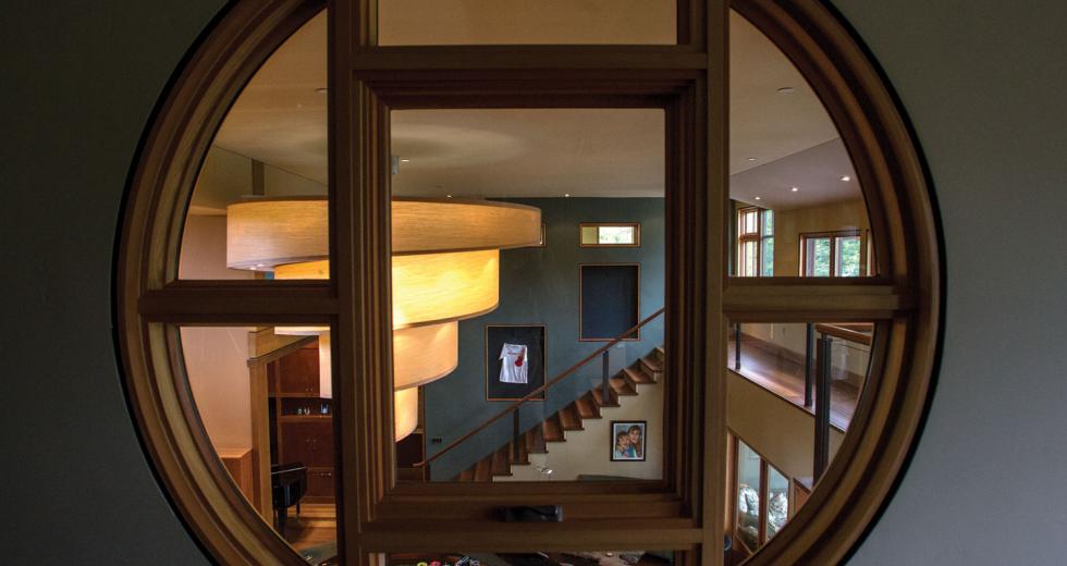
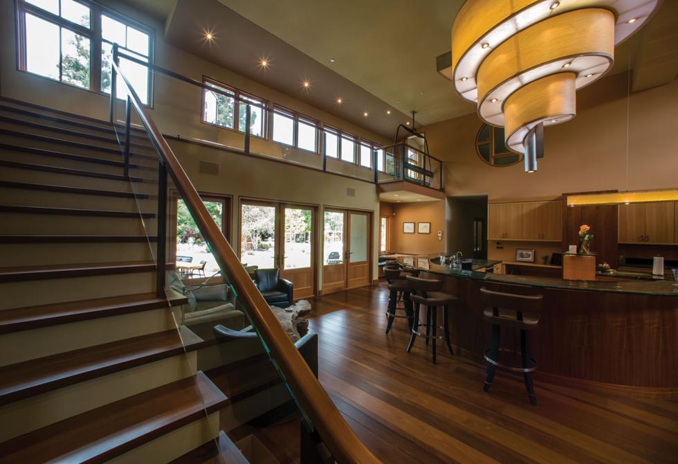
Macaulay + Architects, Penn Valley interior designer Carol Turner and Grendahl Construction Inc. forged a team to demolish a former Sierra Vista residence and rebuild the entire home from scratch. The homeowners wanted contemporary stylings with Asian influence that included industrial elements, such as metal and glass, offset by the warmth and comfort of wood. The materials are anything but basic. The fireplace is made of granite containing real fossils. The wood elements throughout the house are exotic and include beeswing eucalyptus, koa, mahogany and ipe. The colors were selected by renowned colorist Michaelin Reamy. “With the concept of nature, we began choosing fabrics and leathers. After that, we focused on wood and stone and then shape and design of furniture and lighting,” Turner says. “We chose fabrics that had a sheen that mimicked the way light reflects off a lake. The stone in the kitchen has a leather feel … The glass in some of the doors looks like water flowing down a stream.” One of the biggest design challenges was to bring light into the circular kitchen island from two stories high. After months of research, the team realized they would need a custom solution. Industrial designer Kyle Minor designed the fix: a spiral chandelier that is now the focal point of the living space.
Land Park Revamp
Architect: Dh Construction / Designer: Kerrie Kelly Design
Lab
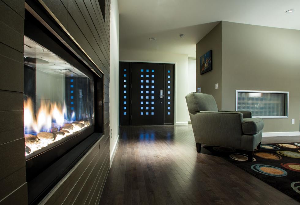
Stripped down to the studs, this classic Land Park property was re-envisioned from the wood floors up with a sleek, modern aesthetic void of clutter. Straightforward design and simple materials, including concrete and metal, give the space a clean look, but it’s not stark — playful colors and textures make the home warm and comfortable. “We incorporate items that speak to the homeowners,” says designer Kerrie Kelly. “We don’t force colors upon people; we want to use what speaks to them.” And force wouldn’t have been necessary anyway; the homeowners opted for a vibrant splash of green in the kitchen, sunshine yellow in the master suite and peacock blue in the guest bedroom. The vibrant pops complement the homeowners’ flourishing art collection, and many of the house’s walls were left bare to accommodate future art purchases. In addition, the design team tackled an overflowing wine stock and built a temperature-controlled, above-ground cellar in the middle of the living space. “It is literally the centerpiece of the home, right off the entry.” Kelly says. “There is a window from the cellar into the living space, so you see the bottom of the bottles through frosted glass,” adding yet another artful element.
Midtown Modern
Architect and designer: Jerry Faszer
When Jerry and Nancy Faszer finished raising their family in the suburbs of Roseville, they sought change. “He really wanted something progressive in midtown. We love the diversity down here, from the very old to the very new … the walking and the activities,” Nancy Faszer says.
So Jerry, a Berkeley-trained architect, dug into a vacant lot the couple owned in the Boulevard Park community of midtown Sacramento. “The house is facing commercial property, so doing something modern at this particular lot made a lot of sense as you transition from commercial to residential,” Nancy says. But not everyone agreed. The sleek, three-story home came against much opposition and “an overwhelming hatred for modern architecture by the various preservation boards,” according to Jerome Faszer, the couple’s adult son.
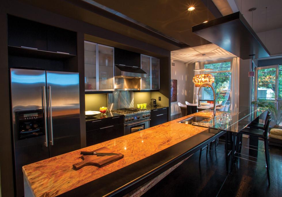
But the Faszers say they love their home, which is airy and uncluttered. The primary living spaces are located on the second and third floors, eye-level with the canopy of nearby trees. Vast glass windows and doors spill onto patios and porches, elevating residents above the street noise. While ample, the clean-lined kitchen wastes no space and instead seems part of the living room. “After having come from a larger house,” Nancy says, “its nice to have such a simple yet livable space.”
Recommended For You

Arts & Aesthetics
Fine art collections serve as on-site museums for some of Sacramento’s culture-loving companies.


