Civic structures such as libraries, fire and police stations, city halls, courthouses, civic centers and public works projects help define a community’s identity. As a group, civic institutions are unique: They are open to and serve the public, and reflect the values of a particular community.
With a waning economy and the dissolution of California’s 400-plus redevelopment agencies to help fund civic projects, alternative funding and delivery models like public-private partnerships and design-build have grown in popularity as they allow local municipalities to better manage costs and risk.
Here we feature six civic projects in the Capital Region that used unique delivery models beyond a traditional proposal process, and employed creative design solutions to produce visually stunning and functional structures worthy of their calling.
Tahoe City Transit Center, Tahoe City
Architect: WRNS Studio / Delivery Model: Design-Bid-Build
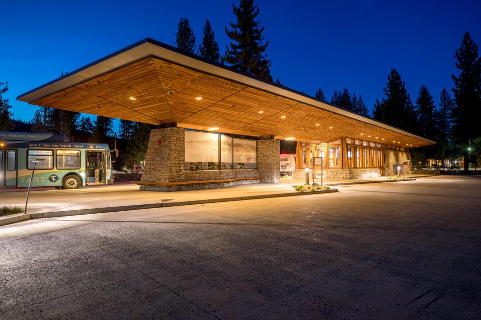
A major tourist destination that welcomes nearly 3 million visitors each year, Lake Tahoe grappled with worsening traffic congestion and pollution that has steadily increased since the 1950s and threatens its natural resources and beauty. This made sustainable transportation options a top priority for the lake community. Placer County needed a transportation hub that would alleviate congestion and elevate the experience of taking public transit. The answer: WRNS Studio’s Tahoe City Transit Center, which is a transcendently simple, modern structure that incorporates local and natural materials, and treads lightly on the environment.
A restrictive building moratorium limits the window of time to get built work done in Lake Tahoe from late October to the spring thaw. The architects behind the transit center used the downtime to stay ahead of the design process and double back on its detailing and construction. The mantra of treading lightly drove every design decision and the configuration of the facility’s footprint.
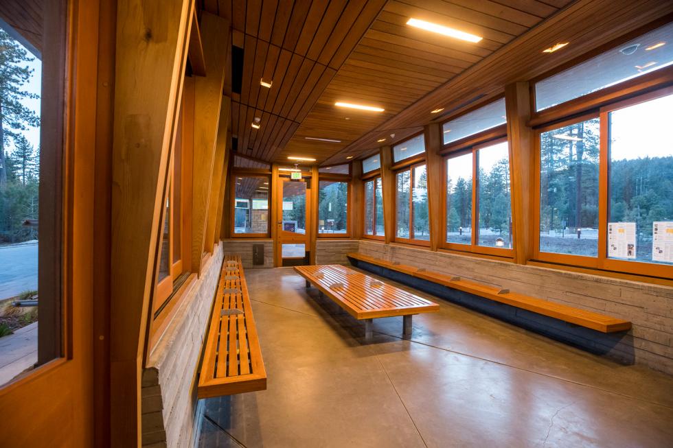
The bus loop was designed with passenger loading on both sides. The site layout incorporated existing trees and established walking and cycling paths. To fit into the natural setting, the center’s horizontal structure is shaped like a boat, with long wooden slats on the underside, hovering among the trees. To emphasize the floating quality, WRNS designed columns and battered walls made from locally sourced Sierra stone to support the main canopy, allowing for large, wide apertures and abundant landscape underneath. The waiting area features oversized, operable windows, making the space feel light and open. The civic scale is important, too. “It feels intimate and small in human scale, but is also quite large for a canopy,” says WRNS partner Wright Sherman. “People are arriving in one mode and transferring to another, and while they are doing that, you are creating something that is more than just a bus stop, but a beautiful place in the forest — kind of like a sanctuary.”
Sustainability features make use of the natural resources through passive strategies, as well as active systems for environmental controls and water management. With a built-in snow-melt system, the roof holds snow all season long and melts it in the spring, capturing the water in an enlarged gutter that wraps around the roof and transports it to a cistern. The treated water is used in toilets and to irrigate landscaped areas. Laminated solar panels on the roof supply most of the facility’s peak energy load. The project was completed in 2012.
Sacramento River Water Intake Structure, Sacramento
Architect: Lionakis / Delivery Model: Public Request for Proposal and Design Competition
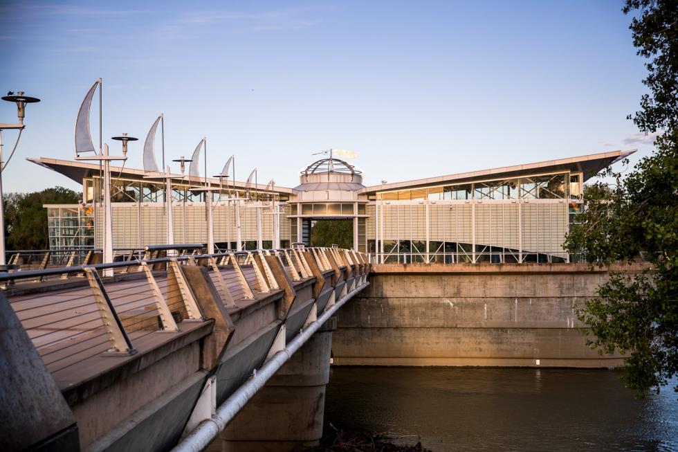
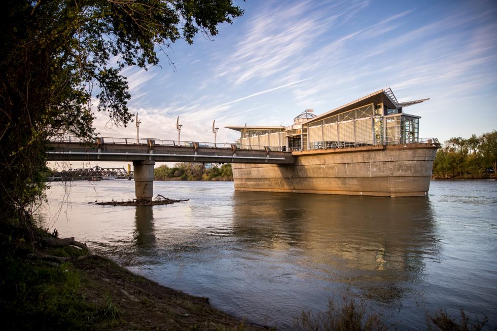
An iconic symbol representing Sacramento’s relationship with its two rivers, the Sacramento River Water Intake Structure is as striking as it is functional. Its job — to supply water at a capacity of 160 million gallons per day and to protect threatened fish species — and its purpose are inexplicably blurred. A visible beacon from several vantage points, the structure was designed to both engage the community and give Sacramento a new river landmark. The City of Sacramento has mandated that public works projects be planned in a way that contributes to public art and architecture, and the intake structure clearly achieves that goal.
Lionakis was awarded the project after a City-led design competition. Several functional challenges had to be addressed in the design, including the profile of the river bottom, the 100-year floodplain, levee requirements and crane heights. With a directive to design a facility that would last 80-plus years, Lionakis specified simple but durable materials such as concrete, stainless steel and glass. The functional elements were encased in a concrete base, with the designed element sitting on top, like a hat. Eight pumps inside the 12,000-square-foot building divert the water, while carefully spaced fish screens protect the migration and spawning cycles of several threatened fish species, including the delta smelt.
For inspiration, Lionakis imagined a dragonfly hovering above the water. That vision resulted in a translucent structure — illuminated at night — that seems to float lightly above the Sacramento River. Outreach meetings involved residents and artists in the design process for the intake facility’s outdoor public spaces. The result: art pieces and spaces that integrate with the architecture to convey a coherent story about the Sacramento River, the habitat, and the role of water in the city’s past and present. An oversized feather by sculptor Phill Evans spins laconically in the breeze above the main building, while stone sculptor Masayuki Nagase’s little red salmon swim below in the pavers. Kurt Runstadler’s bubble glass sculptures reference the draw of the water. An observation deck with educational kiosks highlights the history of Sacramento’s rivers.
Related: Dreyfuss + Blackford Architecture president on civic architecture
“We wanted to create a public amenity that would be a welcome space for the community,” says Lionakis principal Laura Knauss. “People can ride their bikes to the plaza space, go out on the deck and see and learn about the confluence of the two rivers.”
The project has received numerous accolades, including two AIA Merit Awards and recognition as the Water/Environmental Project of the Year from the Sacramento Section of the American Society of Civil Engineers. The project was completed in 2003.
Santucci Justice Center Hon. Howard G. Gibson Courthouse, Roseville
Architect: Dreyfuss + Blackford Architecture / Delivery Model: P3/Design-Build and Cost-Plus Agreement
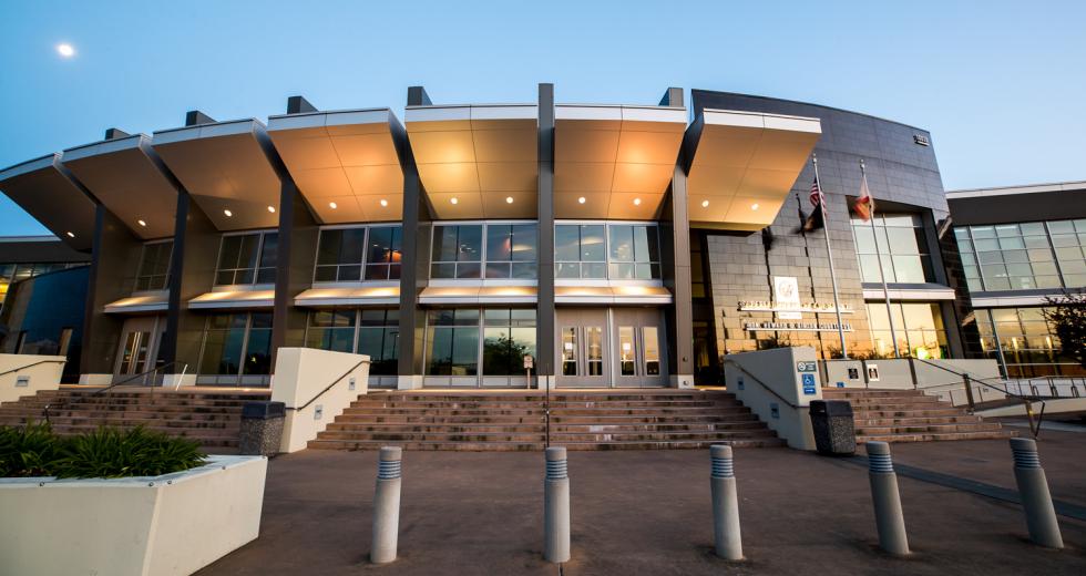
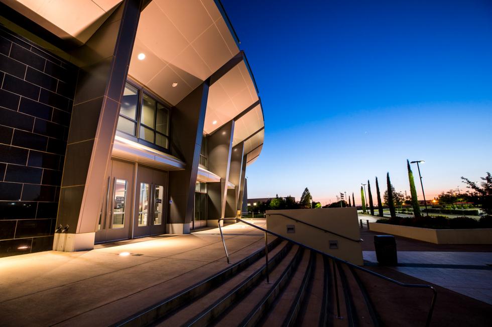
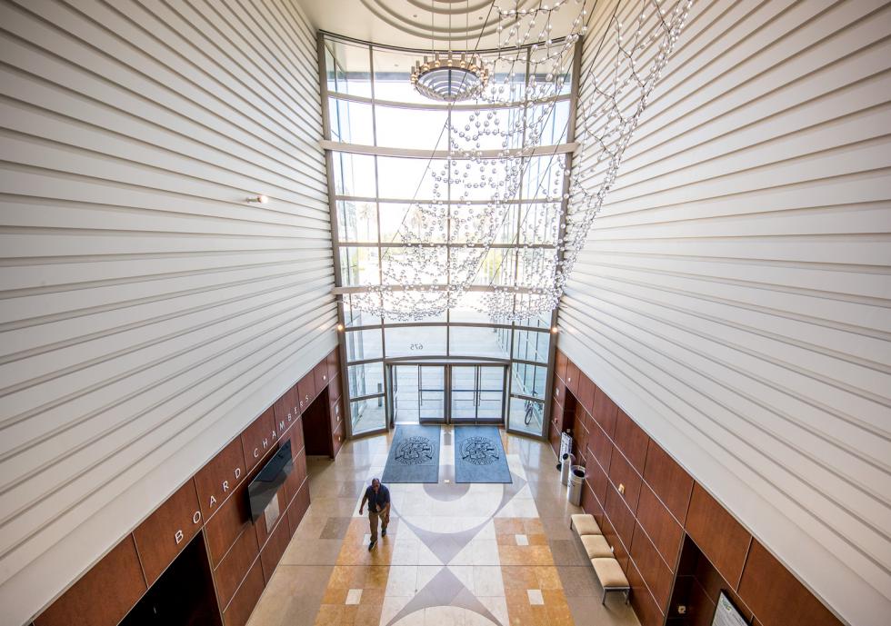
To meet the needs of its quickly growing population, Placer County identified a 100-acre parcel off Highway 65 in Roseville to locate its new justice center and superior court. The modern interpretation of a traditional courthouse yielded a structure with a dramatic and open entryway, large glass windows and contemporary architectural elements that are also sustainable.
The site’s parcel was owned by JB Co. (Joe Benvenuti), a local developer and contractor who agreed to sell the land to the county and build the courthouse. The County signed a short-term lease agreement with JB Co. to design, build and lease back the courthouse, before allowing the State of California to buy it from the County once all the transactions had taken place (the State was in the process of acquiring the responsibility for all courthouses during a seven-year period from 2002 to 2009). Placer County interviewed potential architects to design the project and selected Sacramento architect Dreyfuss + Blackford, which has a vast portfolio of courthouse projects and had successfully worked with the County and the general contractor on previous projects.
For economies sake, the architects explored the idea of using a tilt-up design, with the understanding that the ceremonial face of the building needed to have a big civic expression. That gave the designers an opportunity to economize on three of the four walls and then use the fourth wall for a large, striking entry. Protected wetlands in the area limited the site to 72 acres of usable land, with 5 acres for the courthouse. The remainder is used for other county justice needs, including a jail and sheriff offices. To capitalize on the view and manage the warm temperatures, Dreyfuss + Blackford oriented the building so that the contemplative spaces — the judge’s chambers and the jury deliberation rooms — were south facing and overlooked the natural pastoral wetlands. On the north side, the alignment allowed for lots of glass and was a natural place for the front door of the building. The building kinks, with a knuckle that divides the courtrooms and offices. That kink gave the architects the inspiration for a series of seven individual sets of what they call expressive eyebrows. “It was the kinking of the building that allowed us to create this very unique, idiosyncratic expression,” says president and managing principal John Webre. “We looked to the real transparency involved in the U.S. criminal justice system, which is so unique, and took a very modern view and interpretation of the role of justice in this country.” The project was completed in 2008.
Solano County Government Center, Fairfield
Architect: KMD Architects / Delivery Model: Design-Build and CM Consultant
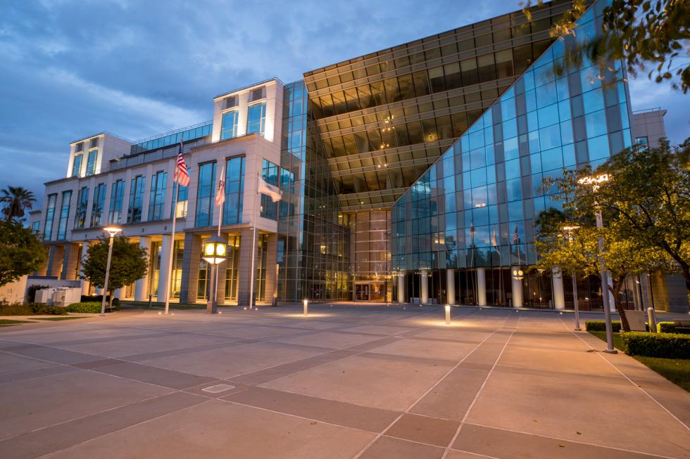
The Solano County Government Center stretches across nearly three downtown city blocks in Fairfield, housing more than 600 county employees and consolidating the administrative and office functions of 16 public agencies from 15 different locations into one centralized facility. The complex sits near the County courthouse and justice center, locating a number of important government functions in close proximity to one another.
After retaining the services of Los Angeles-based Johnson Fain as the bridging architect (who acts as the owner’s design consultant), Solano County invited design-build teams to bid on the project with the stipulation that it be built for a guaranteed maximum price. Because of the sheer scope of the project ($83 million, 343,000 square feet), the County also hired a construction management firm, URS Corporation, to help manage the work and select the winning team. After a competitive review, the team of Clark Construction Group and KMD Architects was awarded the job. “Our vision was to design a very traditional courthouse building, but with modern materials and an impressive front plaza and entrance,” says KMD principal Jim Diaz. “The exterior is extremely modern, but when you step inside, the design is very traditional with an atrium and central stairs and a veranda around it.”
The project consists of a six-story, 300,000-square-foot administration building with an adjacent 43,000-square-foot probation building and a 25,000-square-foot public plaza. A five-level, 1,000-space parking garage equipped with a solar electric system and electric-vehicle hookups is also included.
The modern and sculptural exterior design is marked by a distinctive inverted pyramid at the main entrance. The 100-foot tall administration building includes a massive open entryway and several sustainable features, including recyclable building materials and a grey-water recovery system. Inside is more traditional, with a double-height oval lobby anchored by a monumental staircase and walls dotted with publicly funded artwork.
Despite its size and complexity, the project was completed early, which was crucial for the County as it had long outgrown its old headquarters and had leased office space scattered throughout the city. The design-build team successfully met an aggressive 27-month design and construction schedule to accommodate the County’s phased move-in plan. Employees occupied the upper floors of the main building, while construction was completed below. The new building brought the County services together under one roof. The project has won a number of awards and is certified LEED Silver. It was completed in 2005.
Sutter County Superior Courthouse, Yuba City
Architect: Ross Drulis Cusenbery Architecture / Delivery Model: Public Request for Proposal and Public Contract, State of California
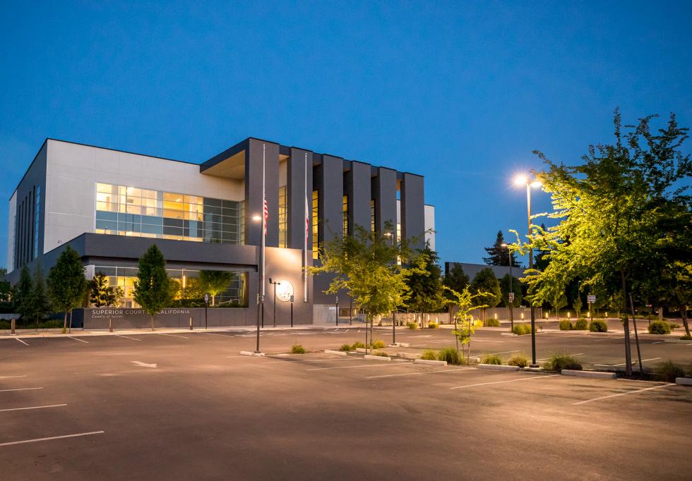
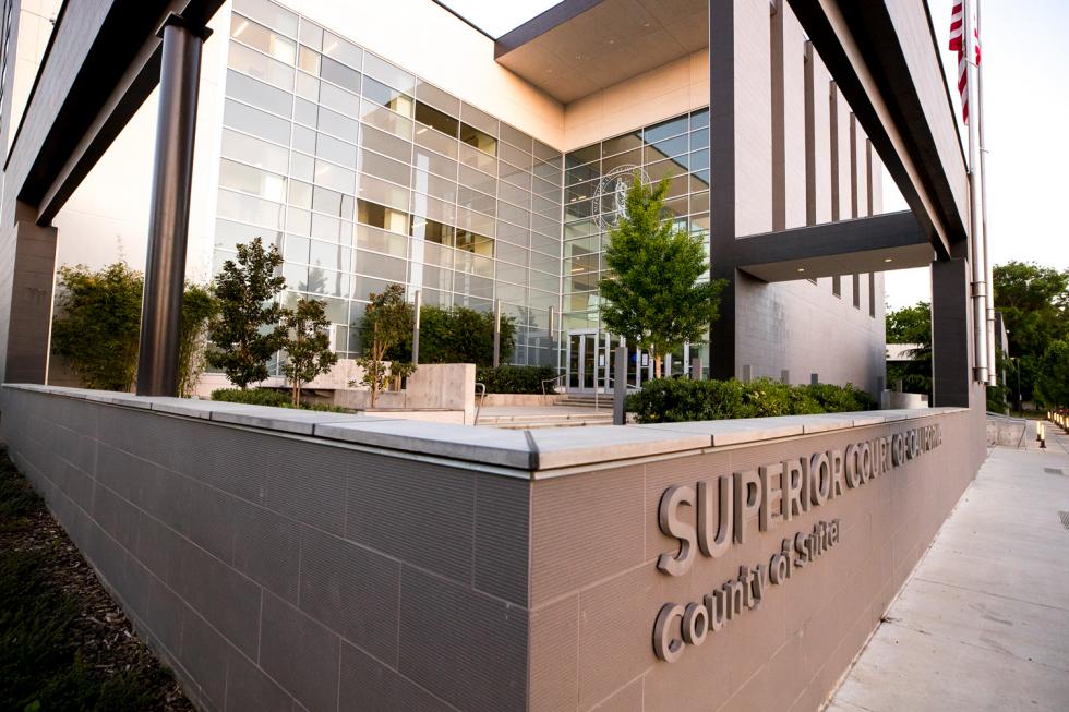
Yuba City’s impressive and strategically designed Sutter County Superior Courthouse stands as a powerful and dignified civic space for the largely agricultural community. Taking center stage in the city’s downtown, the courthouse was erected on a site that had sat empty for more than 30 years. As the tallest building in the city, its symmetrical design and striking vertical elevation make a statement that’s hard to miss.
With noteworthy experience in courthouse and civic projects in and out of California, architecture firm Ross Drulis Cusenbery won the project through a traditional public bid process. The client — the State of California — had taken over all courthouse responsibilities from the counties beginning in 2002 through the Trial Court Facilities Act. The transfer process took seven years and included more than 500 buildings and 20 million square feet of space.
The architects had a stunning site to work with, surrounded by mature tulip trees and the neighboring Sutter Buttes as its backdrop. Drawing its design inspiration from the imposing peaks, RDC created a tall element in a flat landscape whose shape and color mimics the erosion of the volcanic domes of the Buttes. They designed four intimate courtyards, two for the visiting public and two for the staff, which also serve a hidden function as a type of protective perimeter barrier. The building’s strategic orientation with north- and south-facing windows helps mitigate the Central Valley’s hot climate.
“We took this singular block based on the color and volume of the Buttes and eroded it with four courtyards,” says RDC design principal Mallory Cusenbery. “And they became the way to create a softer, landscaped, brighter environment for gathering.”
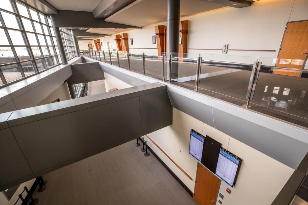
The architects tackled another functional challenge: to acknowledge the emotional layer that comes with being in a court environment. RDC designed a low-contrast environment with very high ambient light and tone-on-tone colors to create a limited color palette that is calm and consistent, with the wayfinding clearly marked. A light-filled lobby and an easily accessible information booth greets visitors. The biggest site challenge was resisting the tendency to attach the courthouse to the jail, but instead treat the courthouse as an independent and standalone civic project. The architects and county agreed to implement a vehicular transfer process. The project was completed in 2015.
Roseville Fire Station No. 6, Roseville
Architect: MFDB Architects / Delivery Model: Design-Assist
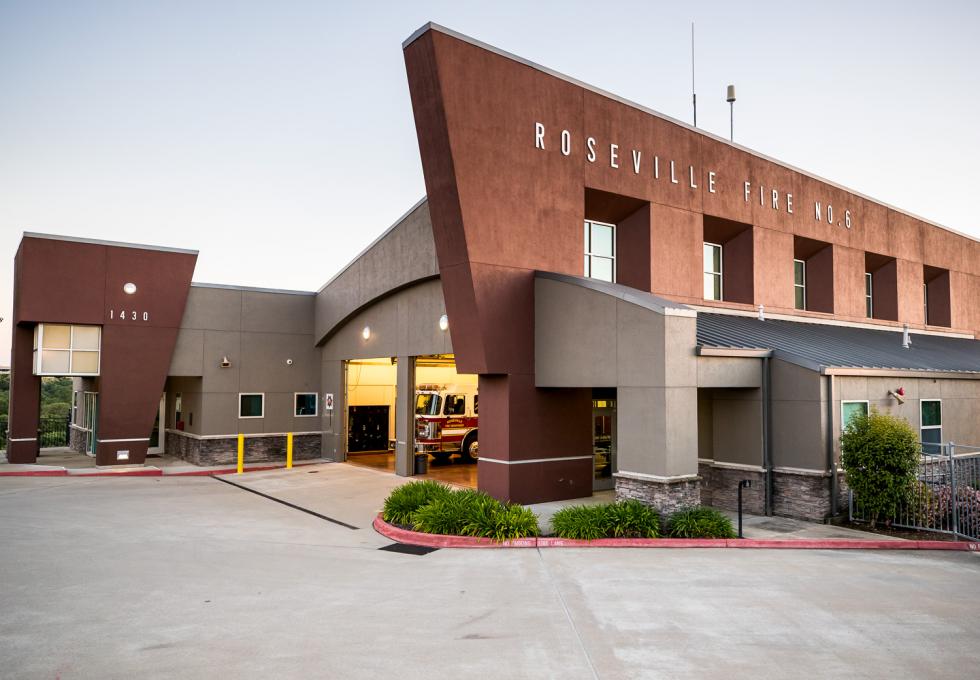
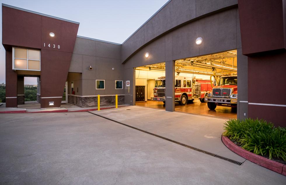
Perched on a hill that overlooks the Miners Ravine Trail, Roseville Fire Station No. 6 was carefully designed to maximize every inch of its compact site. Despite the challenging location, the architects artfully addressed the scale of the space, and the fire facility makes its presence known with a large civic wall that acts as a marker for the community.
With a portfolio of several fire facility projects in the region, MFDB Architects was awarded the project by the City of Roseville after an RFP selection process. The City chose a design-assist delivery model to help protect itself against potential costly change orders, working with MFDB to provide preliminary designs before having them assist with the selection of the general contractor.
Because fire service facilities must be a specific distance (typically 5 miles) from surrounding residential communities to meet homeowner’s insurance requirements, location is critical. The developer created the project’s site with a 35-foot retaining wall and negotiated with the City to accept the site as adequate for a fire facility. The architects had to orient the station in relation to the retaining wall and allow vehicles to safely transition to the intersection and a drive-through apparatus configuration when they returned. The turning radius was carefully planned so personnel could transition the vehicles around the back and then reload them to head out to the intersection in one maneuver.
“A fire station is both a hard-working, industrial building that houses fire equipment and has an important responsibility of firefighters responding to critical emergencies, but it’s also a home, a residence for these firefighters while they are doing their multiday turns,” says principal Tyler Babcock.
The 24/7, 365 facility is expected to work well for 50 years and needs to be durable. The two-bay station was designed with a tall, angled wall that faces East Roseville Parkway and serves as a dramatic, civic expression for the station. From the bays, the building gently slopes down to the patio and occupied staff spaces on the view-side of the building, and are on par with a residential scale. The south-facing orientation allowed for roof mounted photovoltaic panels and created an opportunity to have a prominent civic scale and presence at the busy intersection. The project was completed in 2002.


