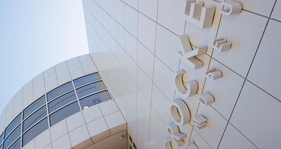
Next month the Crocker Art Museum will open the doors to its new galleries, and some experts say the region could see a museum as notable as those in San Francisco and Los Angeles. Even as it sits unveiled, both architectural experts and museum visitors alike can appreciate the consideration given to its design and construction.
“The building is clearly world-class in terms of its design, its detailing and its craftsmanship,” says Curtis Owyang, vice president and director of design for LPAS in Sacramento. He had the opportunity to visit the Crocker before its completion, and in the early days of the museum’s planning his firm made a bid for the design. “It is easily one of the best pieces of architecture in the region, and we are lucky to have something of that caliber in our city.”
The 125,000-square-foot museum addition was designed by internationally renowned Gwathmey Siegel & Associates Architects, the same New York firm responsible for the 1992 Guggenheim expansion and Miami’s Museum of Contemporary Art. The new building connects to the 140-year-old original museum and provides room to showcase artwork ranging from Californian paintings to Korean ceramics, whereas the historic property was only large enough to display 4 percent of the Crocker family’s collection of more than 2,000 pieces. That’s not counting the hundreds of additional pieces that have been gifted to the museum over the decades, including African and Oceanic wares.
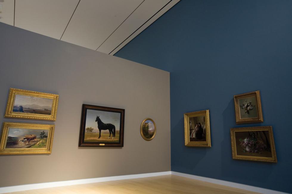
The museum’s paint colors were selected in relation to the art
displayed in each gallery. Designers also relied heavily on the
use of zinc, white metal and glass.
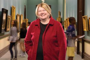
“We wanted to make sure that each collection had its own gallery. Before, our paintings were hung in a bit of a jumble,” says museum Director Lial Jones. “The purpose of the construction was to improve visitor experience and improve operational deficiencies. In the existing building, the museum struggled to fulfill its mission. Every single thing you expect to happen in a museum we didn’t have room for.”
Studio classes, which began at the museum in 1886, according to Jones, will be expanded. Gallery space for the museum’s permanent collection has tripled, and the space for temporary exhibitions more than quadrupled. There is now also a pair of much-needed freight elevators, expanded restoration laboratories and a 260-seat theater.
“There was a tremendous amount of work in making the connection to the existing building seem seamless.”
Gerry Gendreau, associate partner, Gwathmey Siegel & Associates Architects
“Of course we had no idea that we would be gifted new collections, so we’ve already filled our growth space,” Jones says.
The classic contemporary addition constructed by Roseville’s Rudolph and Sletten Inc. is somewhat of an “urban collage,” says Gerry Gendreau, associate partner with Gwathmey. “The context was very challenging. It’s tightly constrained. It’s in an urban center. And the fact that it had to connect to the historic building, is near a park and on the edge of a highway presented unique challenges that you simply don’t see in many buildings. We had to break the building down into multiple pieces and create an urban landscape in and of itself.”
A question of style was raised
frequently during the initial phases of community feedback. Many
participants wanted to know why the firm was choosing to design a
building so different from the original. As a firm, Gwathmey
didn’t want to copy the existing building but instead made
reference to the old without trying to mimic or clone.
“There was a tremendous amount of work in making the connection to the existing building seem seamless,” Gendreau says. “Neoclassical buildings like the existing typically have a tripod type vertical organization — three parts. The new building is divided in similar ways. It’s very referential in terms of the scale and the spaces in between the buildings, keeping the voids and the buildings contextual.”
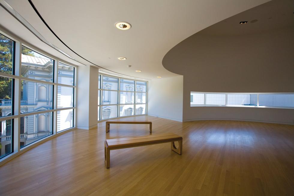
Inside, gallery circulation keeps visitors from backtracking and allows them to see what happens behind the scenes, including the art conservation lab where art is restored and repaired. Windows throughout the new space give consideration to Sacramento’s character. There are quick, narrow views of the adjacent Interstate 5; broad, sweeping views of Crocker Park and its swaths of mature trees; and tall, angular views of downtown.
The first-floor space is about public access and earned income for the museum as it can seat 400 people inside and 1,000 people outside for events ranging from fundraisers to weddings.
“The building is clearly world-class in terms of its design, its detailing and its craftsmanship.”
Curtis Owyang, vice president and director of design, LPAS
A narrow, manipulated gallery connects the east to west between the second and third floors. Large, spacious galleries accommodate sizable paintings and sculptures. A floor-to-ceiling window aligns with the west face of the historic building, allowing for cornice-level views. You get a sense of how thick the historic walls are and the detail put into the design.
The museum’s paint colors were selected in relation to the art
displayed in each gallery. Designers also relied heavily on the
use of zinc, white metal and glass.
An orientation gallery on the third floor is a semi-circular space offering panoramic views of the adjacent park and courtyard. “You would never have experienced [this] before because you couldn’t get high enough to appreciate the full facade,” Gendreau says.
The use of natural light is evident throughout the building, which was a tricky feat, according to Gendreau, who used emerging technologies and materials to control the light coming in and keep the heat out.
“It would have been nice if there was more of a public gesture to I-5. A lot of people will see the building from the freeway — many more people will drive by than will come in,” Owyang says. “From the freeway you only see small openings. There are interesting forms and shapes, but they could have displayed artwork through a large window or opening that could have been seen by the public and drawn people in.”
Recommended For You

What’s Eating Tim Collom?
A success in art and realty, Tim Collom still can’t relax
“Something isn’t quite right with Tim Collom. On the outside, Collom is doing far better than most of us. In the past year, he has been featured on KCRA-TV and HGTV speaking about real estate and in the pages of The Sacramento Bee and Sacramento Magazine showcasing his paintings.
Words of Art
Shabby neighborhoods are being brought to life with public art
Public art is about more than intricate town square sculptures or decorative murals that mask the walls of blight. At its best, public art doesn’t simply beautify a space, it engages a community by reflecting and helping to define the environment around it.
Philanthropy Isn’t What It Used to Be
Acuity with Crocker CEO Lial Jones
Since August 1999, Lial Jones has served as director of the Crocker Art Museum. During her tenure, she has led a capital campaign that successfully raised more than $120 million to finance the Teel Family Pavilion, a 125,000-square-foot addition that opened in October of 2010.


